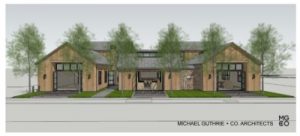
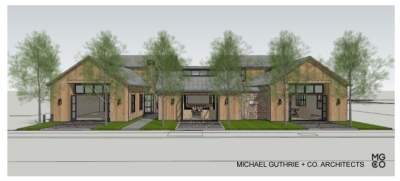
 As residential Realtors, we trade in The New Black, The Modern Farmhouse, Contemporary Craftsman, Minimal, Agrarian, Barn Redux, and other marketing tags. I understand the need to describe and distinguish. But I genuinely appreciate this example in which residential and commercial architecture blur in the Napa Valley. These rural ag silhouettes don’t need labels . . . this place making, pedestrian friendly project in Yountville speaks for itself.
The newly approved Washington Street design for Handwritten Wines creates public space and commercial retail, office, and apartment spaces in buildings that connect to and are informed by their surroundings. It invites passers by in, as an extension of their sightseeing day, or a respite during the work day. It offers purposeful places that allow one to linger and reflect upon where you are in life, literally, in the middle of Napa Valley’s sea of winegrowing.
Like a great house, this commercial project creates comfortable, practical shelter from busy life, sanctuary for creative expression or renewal, and room for tasks. And to those who bemoan any development, I say, thanks for the property taxes and sales taxes and transient occupancy taxes that make Napa Valley hum, and thanks for spaces that locals and visitors alike can share.
Architecture is lasting, and when it’s good, it’s good for all. This work by Michael Guthrie + Co. Architects enhances all of our experience of the site, not just the owners’ or the occupants’, but the community’s as well. It has A Sense Of Place. Architecture should belong, mirror, and enhance. Just like the best neighbor, a building should converse with, listen to and share with the neighborhood. This one does. Just my sense. www.mgandco.com
Posted By Linda Fischer At 3:31 PM •

